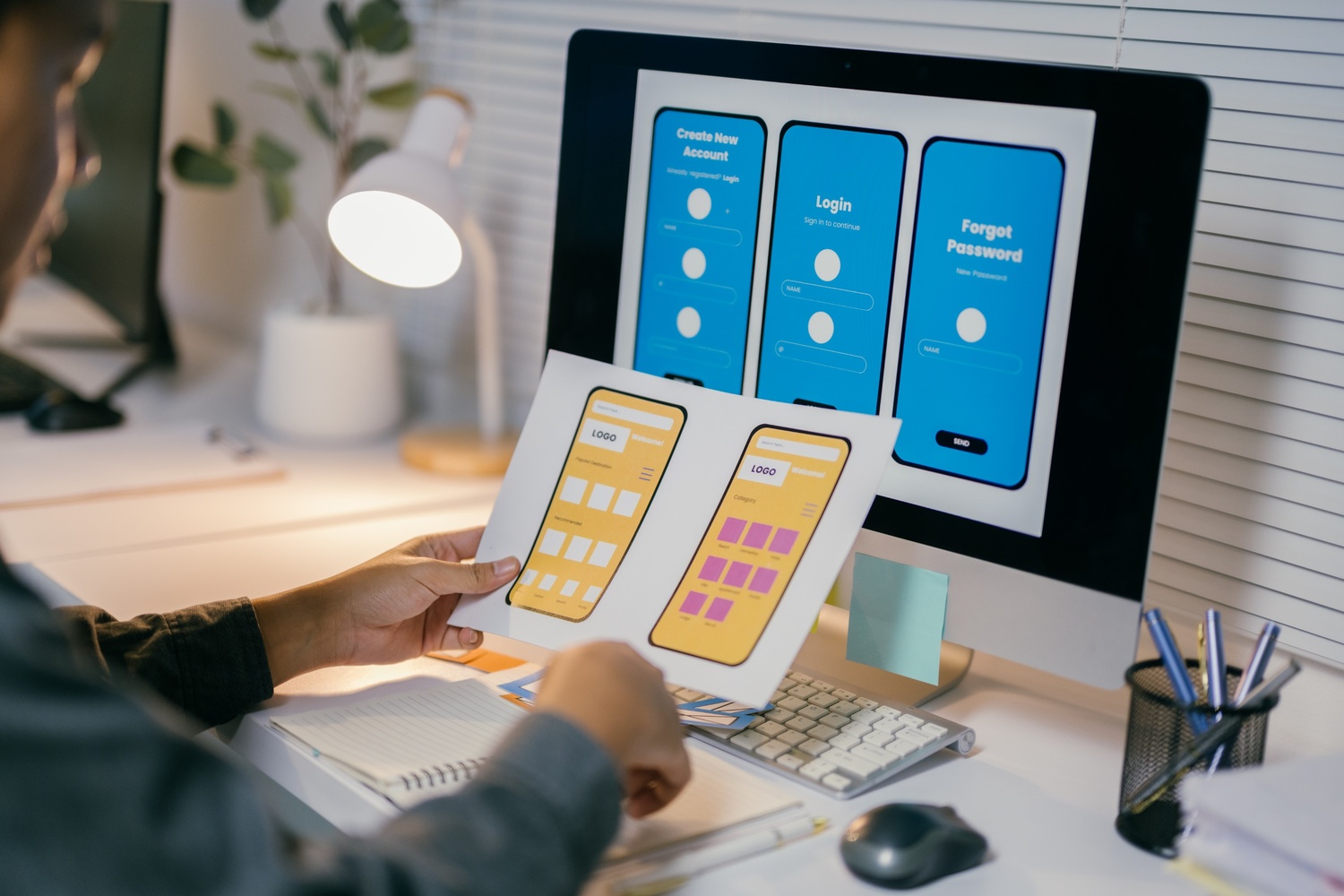
In the world of web design, empathy is more than just a buzzword—it’s a guiding principle. Empathy design places the user at the center of every decision, ensuring that websites are not only functional but also meaningful. By understanding the emotions, needs, and goals of your audience, you can create digital experiences that truly resonate.
What is empathy design?
Empathy design is the practice of stepping into the user’s shoes to anticipate their challenges, desires, and expectations. It’s about moving beyond surface-level aesthetics to focus on how a user feels while interacting with your website.
This approach requires designers to actively listen to user feedback, observe behaviors, and make thoughtful choices that prioritize user satisfaction and engagement.
Why empathy matters in web design
A design that lacks empathy can frustrate users, resulting in high bounce rates and poor retention. On the other hand, empathetic designs foster trust, ease navigation, and enhance user satisfaction. Websites that make users feel understood often stand out, creating loyal customers who return again and again.
How to apply empathy in web design
1. Conduct user research
Empathy begins with understanding. Use surveys, interviews, and analytics to learn about your users’ preferences, pain points, and goals. Real data helps you make informed decisions that align with user expectations.
2. Develop user personas
Create detailed personas that represent different segments of your audience. Include their needs, motivations, and potential challenges. These personas serve as a blueprint for designing experiences tailored to specific user groups.
3. Map user journeys
Visualize how users interact with your website from start to finish. Identify key touchpoints where users may encounter challenges or need guidance. By understanding their journey, you can remove obstacles and create smoother interactions.
4. Focus on Accessibility
Empathetic design is inclusive design. Ensure your website is accessible to all users, including those with disabilities. Use proper color contrast, alt text for images, and keyboard-friendly navigation to make your site usable for everyone.
5. Test with real users
Empathy design is an iterative process. Conduct usability testing with actual users to gather insights on what works and what doesn’t. Incorporate their feedback to refine your design further.
6. Anticipate Emotional Responses
Design isn’t just about functionality—it’s about feelings. Consider how your color scheme, typography, and content tone evoke emotions. A warm, welcoming interface can make users feel valued and at ease.
Real-world examples of empathy design
- Duolingo: The app’s playful interface and encouraging messages make learning feel less intimidating, meeting users’ emotional needs.
- Airbnb: Their design focuses on creating trust and comfort for both hosts and guests, emphasizing safety and community.
- Slack: By blending efficiency with humor, Slack’s interface makes workplace communication enjoyable and stress-free.
Maecenas iaculis pharetra nunc sit amet malesuada. Nulla facilisi. Fusce molestie at libero at ultricies. Suspendisse iaculis orci quam, at iaculis nisl dapibus eget. Quisque quis aliquet nisl, maximus viverra ligula. Sed erat elit, luctus id pulvinar quis, consectetur vitae ex
The impact of empathy design
Empathy design goes beyond meeting basic user needs; it creates memorable experiences that foster loyalty and trust. By putting yourself in your users’ shoes, you can build websites that not only solve problems but also delight and inspire.
In the end, empathy is what transforms a functional website into a meaningful one. It’s the bridge between a brand and its audience, creating connections that last. So, the next time you design, ask yourself: How does this make the user feel?
Empathy isn’t just good design—it’s human design.